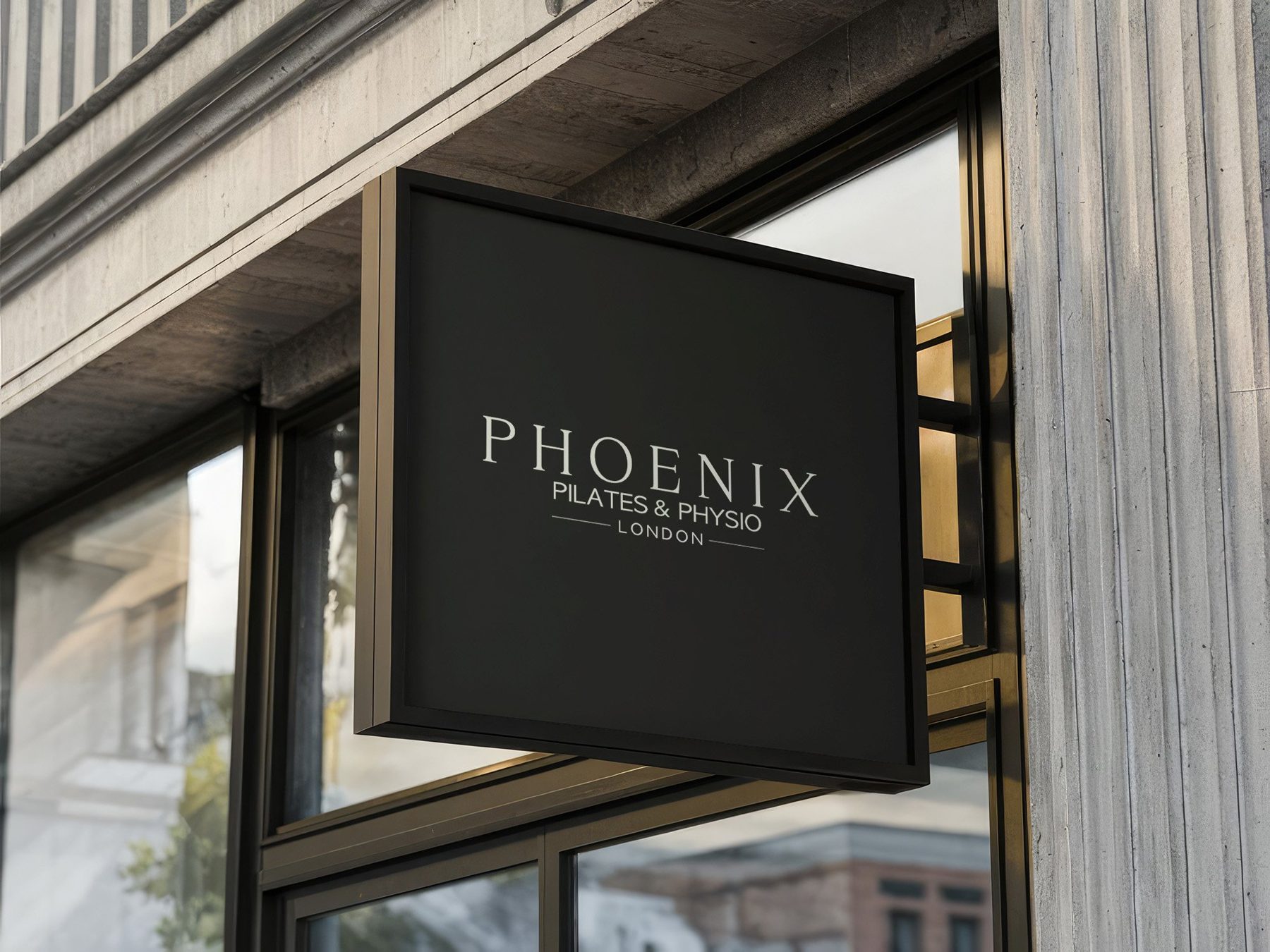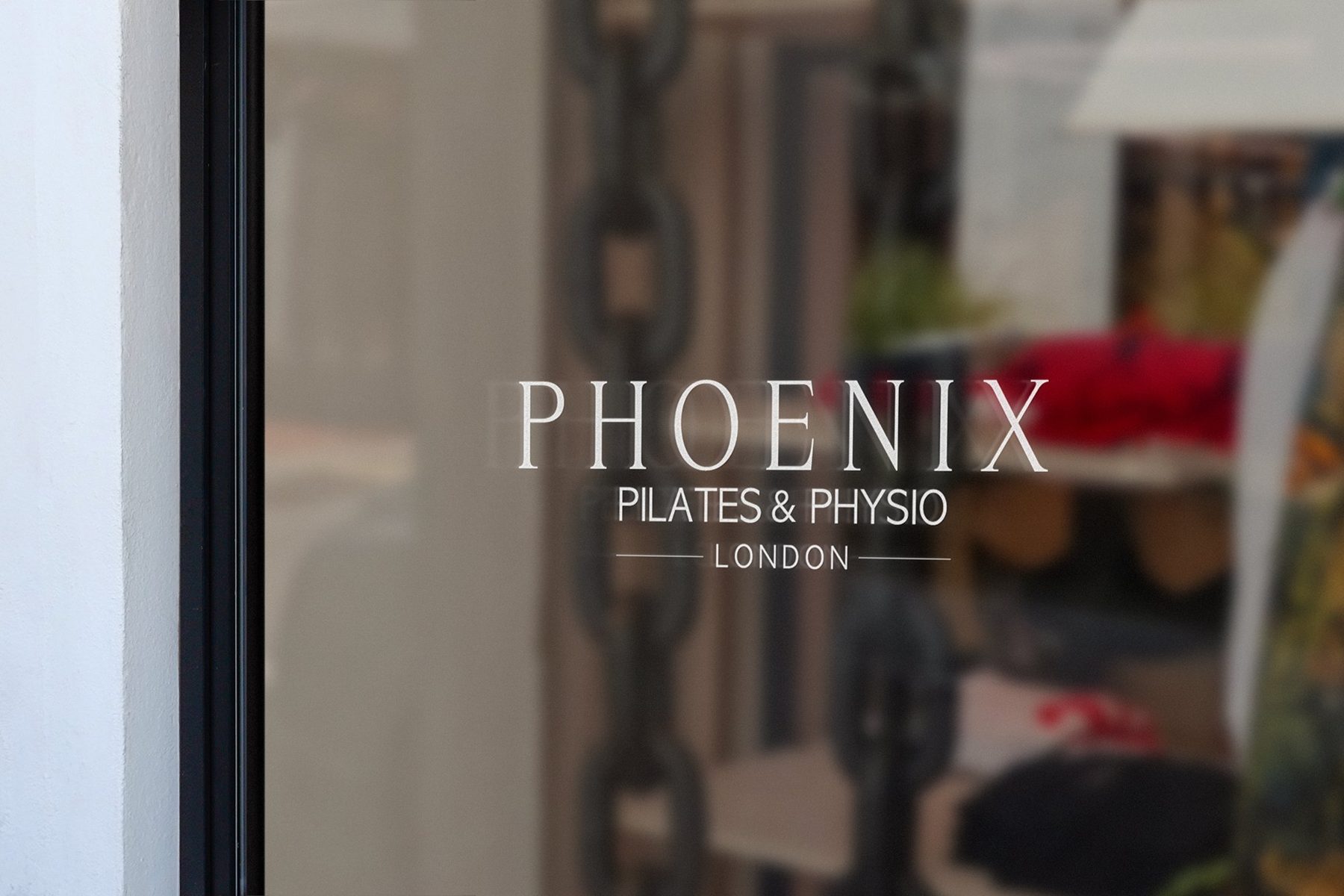
Phoenix Pilates & Physio · 2024 – 2025
A brand, website and copy for a London studio that blends clinical Pilates, physiotherapy and classical ballet, built to look nothing like the rest of its industry.
London, UK
The Phoenix Pilates & Physio website
The brief
Marc Goldberg runs a physio-led Pilates studio in Putney, South West London, drawing on about 17 years in physiotherapy and clinical Pilates and a background in classical ballet. He couldn't find a single brand in his industry he liked, and wanted the opposite of soft wellness pastels: "more Apple, less Marriott". The brand had to be edgy, beautiful and clever, but still informative. The name and the tagline, "Bodies Reborn", speak to recovery and renewal through movement.
My role
I ran the project end to end: creative brief, logo concepts, brand colours, brand guidelines, all the website copy, and the website design and build. I still look after the site on a two-year care plan.
What I did
- Identity: four first-round concepts, refined over two more rounds into the final mark and the phoenix icon.
- Brand system: a deep palette of plum, oxblood and a vivid red on off-white, paired with a licensed display typeface, and a full logo set.
- Brand guidelines: logo use, colour and type.
- Website and copy: the method and its three pillars, the studio, services, testimonials and an FAQ, with booking calls to action throughout, linked to online scheduling.
- Ongoing care: content updates and new sections switched on after launch.
Results
The site launched in February 2025 and is on a two-year care plan. It now carries testimonials from clients who recovered from back, knee and shoulder problems.